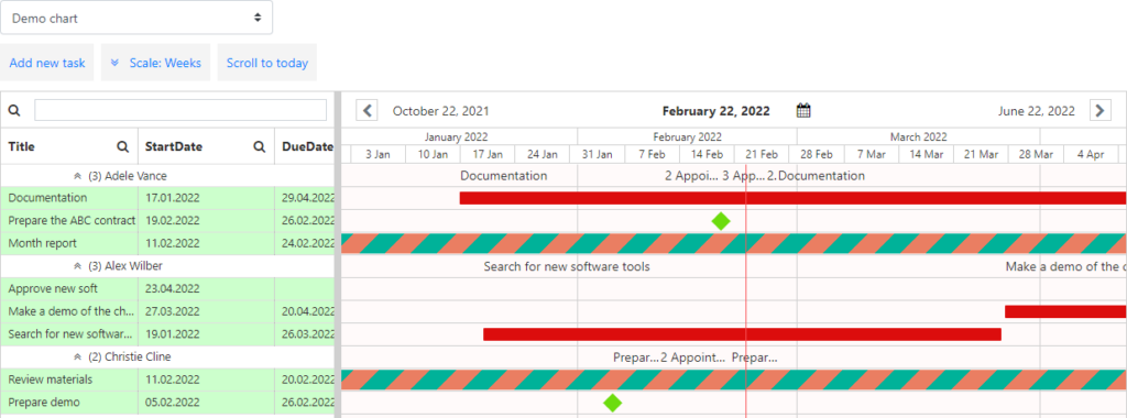
When the app is adjusted, it consists of two visual parts.

Note: See the “Adding App to a SharePoint site” section to specify a chart for each page.
The left part includes the list of resources (users, task names, date and time, etc.). The right part shows the timescale with tasks planned for a single period with chosen colors. The number of tasks assigned to a person for the same period is shown on the chart. The visualized resource utilization helps managers to edit the plan depending on workload. Place the cursor on the number of tasks to see the detailed information in a tooltip.
